
Every year since 1999, Pantone, the color-matching company, has named a “color of the year.”
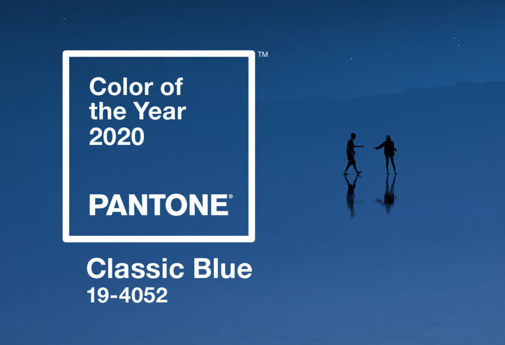
The 2020 color of the year is Classic Blue (19-4052).
Resembling the color of the sky at dusk, Pantone chose Classic Blue in part as a nod to our collective desire for stability and reassurance as we enter a new decade. It’s hoped this calming hue will soothe and reassure consumers who seemingly are buffeted by daily stories of political and economic instability.
As Leatrice Eisman, the Director of the Pantone Color Institute, put it:
“We are living in a time that requires trust and faith. It is this constancy and confidence that is expressed by PANTONE 19-4052, Classic Blue, a solid and dependable blue hue we can always rely on. Imbued with a deep resonance, Classic Blue provides an anchoring foundation.”
A TREND IS BORN
Whether or not you believe as Eisman does that surrounding yourself with Classic Blue will provide you the confidence you need as you enter 2020, one thing is certain: Pantone has a track record of accurately predicting (and encouraging) color design trends.
If you keep your eyes peeled as the year unfolds, it’s likely you’ll notice the 19-4052 shade of Classic Blue appear in clothing items, such as shirts and jackets, accessories, like purses or watch bands, home furnishings, glasswork, and even in Hollywood television sets and features films.
AN IMMERSIVE EXPERIENCE
To unveil the 2020 color of the year, Pantone created an immersive Classic Blue experience, inviting designers to interpret Classic Blue not only in objects (like lamps, sofas, and tables) but also in scents, tastes, and textures.
According to CNN’s coverage of the event, one designer imagined Classic Blue feeling like velvet; another imagined it smelled sweetly musky; yet another imagined it tasting like the concentrated juice of berries. Classic Blue themed music wafted over the assembled crowd.
It’s easy to question just how accurately a color can be translated into other senses. Does it taste sweet or dark? Does it feel plush or smooth? Is it warm to the touch or cool?
What isn’t in doubt, however, is that color has a powerful pull on our emotions. More readily than shape, the colors you choose influence how people feel in a space. Tie together an interior with subtle greys and it will feel different than if you had used beiges, whites, or yes, Classic Blue to anchor your design.
OMT-VEYHL’S COLOR IS… YOURS
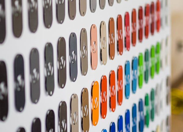
At OMT-Veyhl, we are big fans of color. In fact, we care so much about color that we’ve invested in the ability to apply a vast array of different color finishes matched to your color palette.
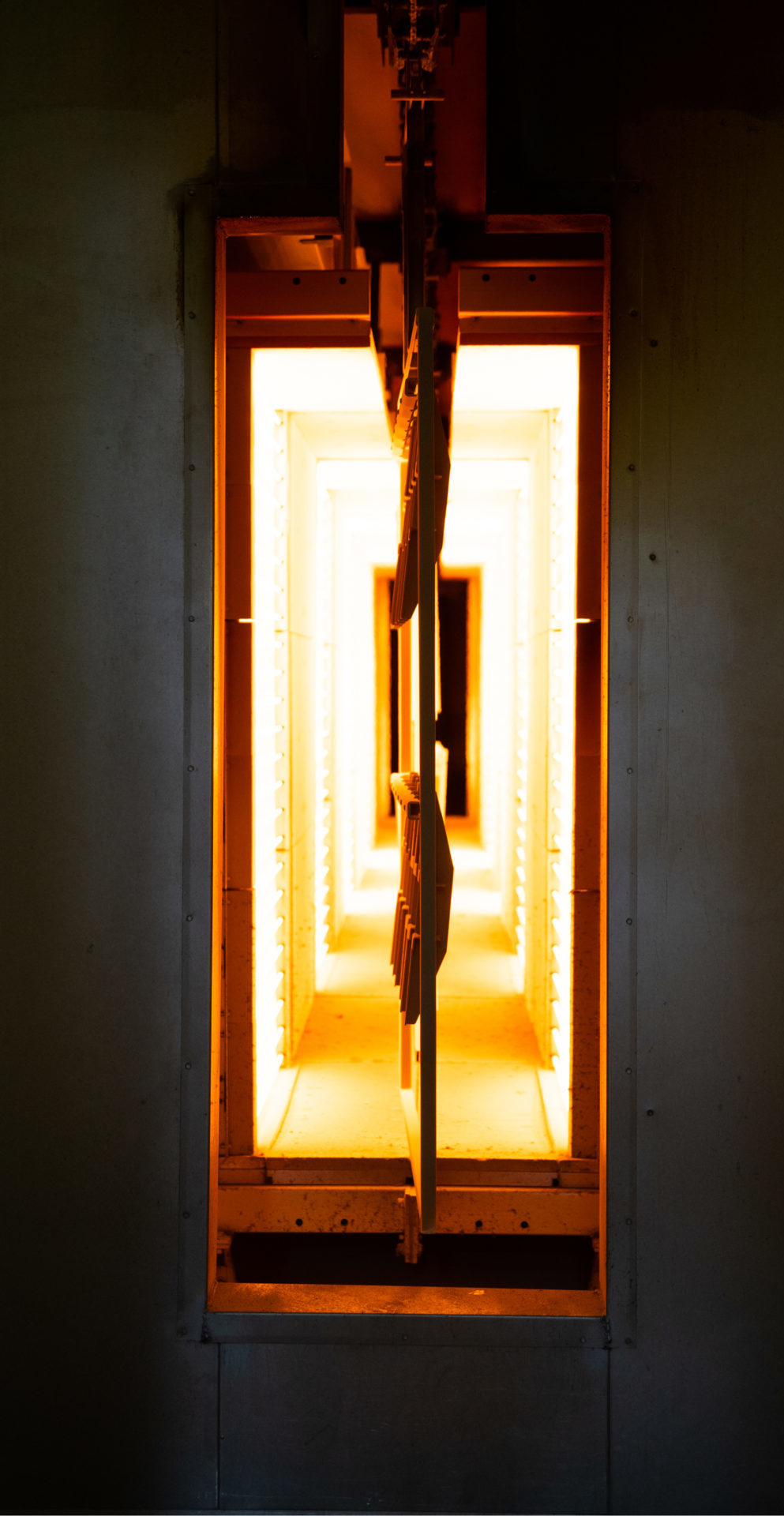
Does your new line of adjustable height tables require just the right shade of white, grey, or black? Chances are we can match it exactly in our impeccably-applied powder coating process.
Does your tailored solutions client have an architect or designer who insists on a very specific shade of classic blue? We’ll work with you to match the color and integrate it into our manufacturing process so every part you receive matches.
WANT MORE GREEN? MAKE SURE YOU HAVE THE RIGHT COLOR EVERY TIME
It’s details like that which explain why OMT-Veyhl partners win more bids for tailored solutions.
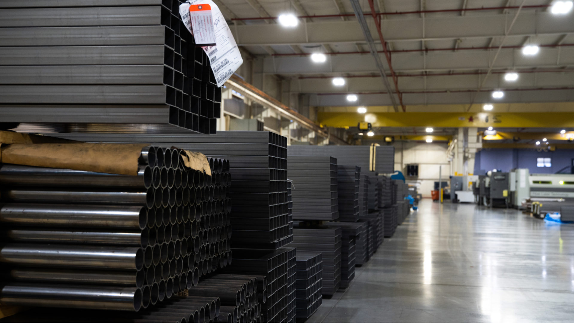
Compared to working with globalized supply chain partners, at OMT-Veyhl the distance between design submission and prototype is usually 8 days or less. That means you get more opportunities to get the design and the space right, so you close more sales and make your clients happier. Learn more about our prototyping capabilities for OEMs.
Plus, since we’re based in the US, there are no expensive air freight bills or customs delays to worry about.
Finally, we prototype on the same automated machinery and laser-welding equipment we use when we manufacture, so you can rest assured that the production parts you receive will match the prototype you approve.
Add these benefits together and you’ll start to understand why our clients often find themselves grateful they’re working with us every time an A&D firm’s creative director emails her latest “brilliant” idea.
Give us a call today and learn more about how we can help you stay ahead of the curve when it comes to color. You might be surprised just how empowering working with OMT-Veyhl can be.
Recent Comments