
Is there meaning behind the colors throughout your office? First, consider your brand story. Emphasize your company colors throughout your building to drive passion for your brand. Second, decorate by playing with colors based on the different emotions they evoke. Consider walls that can be painted, furniture that can use an added pillow, or even the potential to add color in the details, such as with pencil holders and sticky notes.
When brands choose their logos, they spend time deciding how they want to use shapes and colors to portray their company image. It might not be a bad idea to do the same for your office buildings.
Work Design Magazine wrote: “many companies and organizations will collectively spend billions in ensuring [an association with colors, feelings, and their brand] is achieved with the public, but often forget to look inward and nurture the brand ambassadorship of their employees, using the built environment as a tool.”
Take a room and throw a few desks in it, and you technically have an office. However, it is more important to take the time to design your spaces and create an environment that your employees want to work and customers will remember.
Choose a Color Palette
Choosing your color palette is one of the first steps of designing.
Everyone loves neutrals – gray, beige, white, black. It is easy to visualize them in any space. However, bringing an element of color into your offices can actually have an extremely positive impact on your employees.
Don’t forget to take into account the shade and sheen of the colors you choose. Not all tones of colors were created equally – take a lemon yellow and a mustard yellow, for example, and notice the different ways they make you feel.
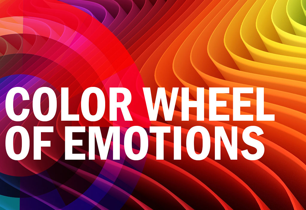
How Colors Affect Emotions
Check out what each of these colors mean below:
Red: Red is bold, passionate, and elicits action. The color red might make you think of stop signs, love, or really fast cars. No matter what you are thinking, however, red means something to you.
Orange: Orange is confident yet energetic. People say that orange also goes hand-in-hand with creativity. While orange is a bold color, it isn’t quite as overpowering as red.
Yellow: Yellow is happiness and joy. People often associate yellow with the sun and a fresh start each day, leading to feelings of optimism.
Green: Green is natural and refreshing since most people think of plants. However, some people also associate green with money and wealth.
Blue: Blue is mostly commonly associated with peace, but its variances between light and dark seem to elicit a greater scale of emotion compared to other colors.
Purple: Purple is often seen as luxurious and is associated with royalty.
What the Neutrals Say
Colors provide the opportunity to make a statement; however, neutrals are not completely out of the game. An obvious neutral, white is clean and simple. A more complex neutral, black shows strength and mystery. Black is also used for sophistication but can sometimes be more related to fear. Gray falls in the middle, showing professionalism without risking the lines of seeming unapproachable.
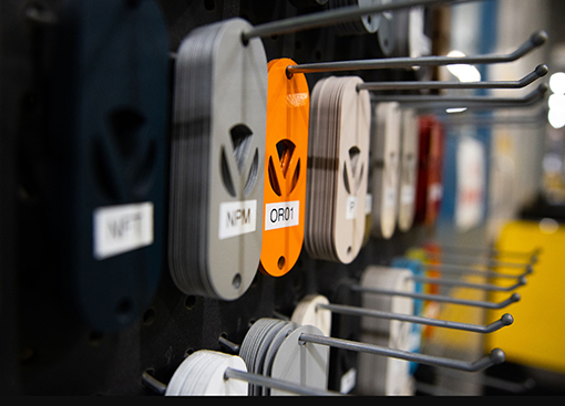 OMT-Veyhl’s Color is Yours
The OMT-Veyhl orange represents who we are – from our innovation to our reliability. And while we are proud of our brand, as your manufacturing partner, we want to help you create the solutions that represent you. Whether you prefer a calming blue or a fiery red, OMT-Veyhl offers more than 200 standard colors and a variety of finishes to match your color palette.
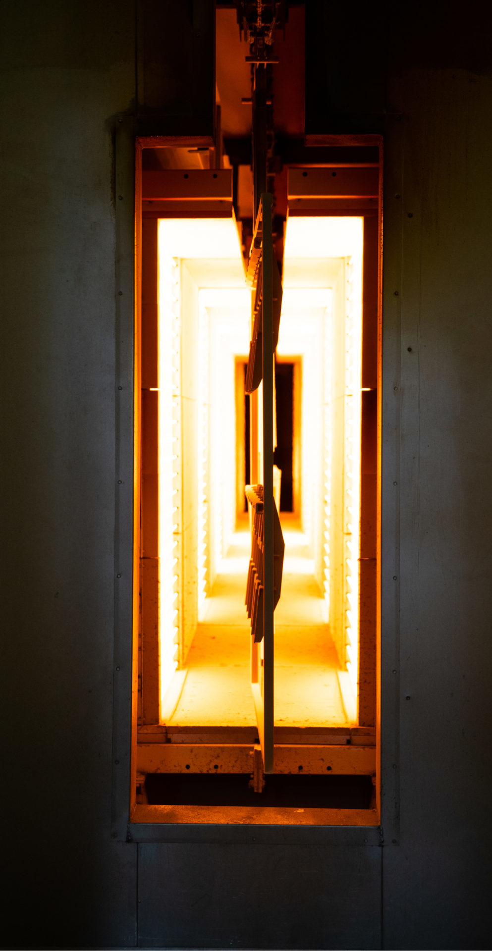
Two separate powder coating lines are available to accommodate your needs for everything from small-run customization to large-order production.
Contact us today for more information about how OMT-Veyhl’s products and processes could be the perfect fit for you. You might be surprised just how empowering working with OMT-Veyhl can be.
Recent Comments