
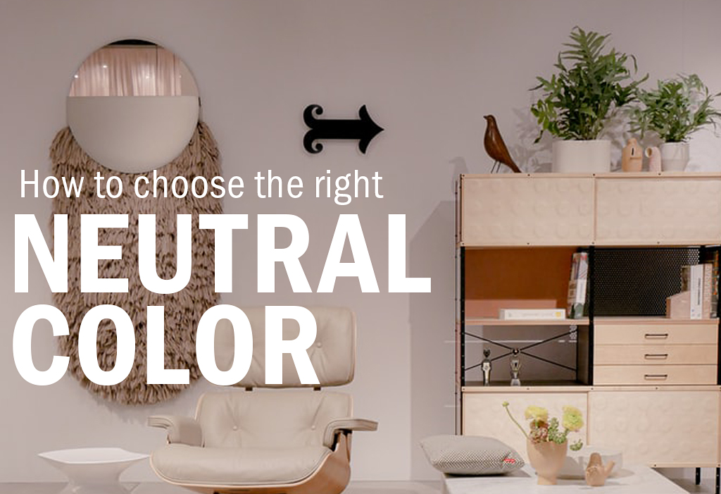
When tasked with designing a space, one of the first determinations to make are the colors you’ll be working with. Whether it is a hospital, office, classroom, or living space, you’ll have important choices to make that will affect the mood of your environment. Maybe you’ll choose a fiery red, a calming blue, or another hue. These hold their own and will control a space.
However, another option is the choice of working with neutrals. These colors are vital elements of design and might play a bigger role than you expected. Have you ever thought about the endless options a neutral color can leave you with?
Not All Neutrals Are Created Equally
Colors, even neutrals, come in a variety of shades and depths that provide different ambiances for a space. Even a subtle nuance can be noticed.
Black, white, and gray are all neutrals, while some designers also consider shades of beige and brown in the family.
By choosing different neutrals and their various tints and shades, you can design either boldly or softly. There is an obvious difference between black and white, and the mood of a room can easily be affected by the ways you implement each. An article in Better Homes and Gardens frames the difference by noting that “white enlivens a color palette, while black strengthens and stabilizes.”
However, it isn’t just the neutrals on the opposite ends of the spectrum that make a difference. White, for example, has many of its own looks that can completely alter a space.
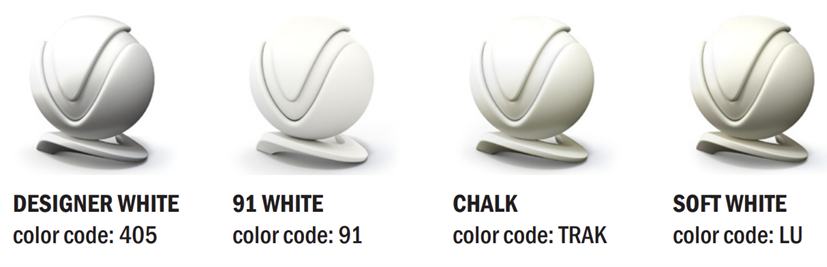
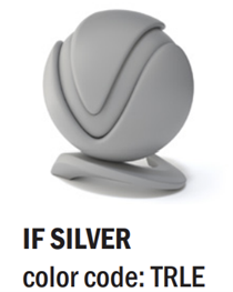
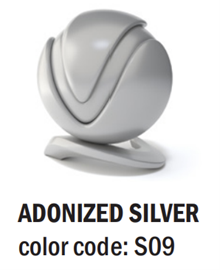
For example, white can be both warm and cool. OMT-Veyhl offers more than 200 color options, with a large portion as various shades of neutrals. You can see in these powder coat options that each white brings a distinctive presence.
A creamy white feels comfortable while a true, sterile white is an entirely different level of bright. Warmer whites match beige and other warm colors, while a cool white with undertones of blues and purples will look better with gray. It is important that you stay consistent with the temperature of your colors throughout the entire room.
Other Considerations
 In addition, making the choice between a shiny or matte finish will greatly alter the overall look. Shine tends to add vibrance while matte is rich and modern. The size of your space and your willingness to frequently clean and dust are important considerations when making this decision. A shiny finish is more forgiving in both of those aspects.
Once you choose which direction you want to go with your neutrals, make sure to choose lighting that also fits. The same way paint colors have tones, lights do as well. You don’t want to throw off a perfectly white room with a yellow light.
Picking your color palette is exciting! Take time to explore which neutrals you want to incorporate and determine the right tint, shade, and undertones that match the desired design style.


Recent Comments